matplotlibの棒グラフを透過させてみましょう。
matplotlibの棒グラフのドキュメントは こちら です。
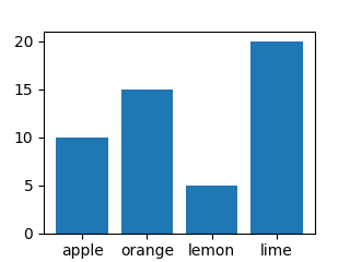
サンプルの棒グラフを描画する
デモサイトを見て、サンプルの棒グラフを描画します。
import os
from datetime import datetime
import matplotlib.pyplot as plt

data = {'apple': 10, 'orange': 15, 'lemon': 5, 'lime': 20}
names = list(data.keys())
values = list(data.values())

fig, ax = plt.subplots(1, 1, figsize=(3.2, 2.4))
ax.bar(names, values)

filename = 'graph_bar_' + datetime.today().strftime('%Y%m%d') + '_a.png'
file_path = os.path.join(os.getcwd(), filename)
plt.savefig(file_path)
棒クラフが出力されます。
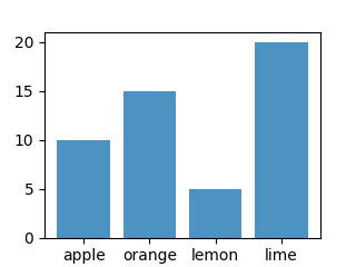
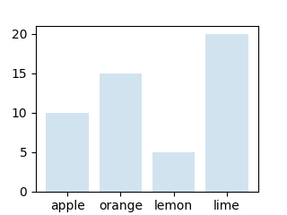
棒グラフの透過率を設定する
透過率は alpha で設定します。
値は 0.0~1.0 の間で設定します。
alpha は値が小さいほど透過率が高くなります。
alpha=0.8 よりも alpha=0.2 の方が、棒グラフの色が薄くなります。
import os
from datetime import datetime
import matplotlib.pyplot as plt

data = {'apple': 10, 'orange': 15, 'lemon': 5, 'lime': 20}
names = list(data.keys())
values = list(data.values())

fig, ax = plt.subplots(1, 1, figsize=(3.2, 2.4))
ax.bar(names, values, alpha=0.8)

filename = 'graph_bar_' + datetime.today().strftime('%Y%m%d') + '_alpha08.png'
file_path = os.path.join(os.getcwd(), filename)
plt.savefig(file_path)
alpha=0.8 の場合は、こうなります。
alpha=0.2 の場合は、こうなります。
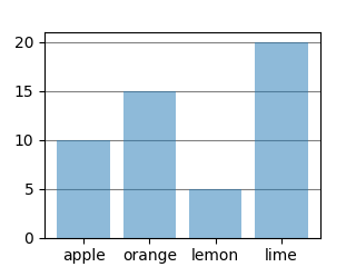
棒グラフにグリッド線を付ける
グリッド線はax.grid()で付けることができます。
matplotlib.pyplot.grid のドキュメントは こちら です。
グリッドの主なパラメータは、axis/color/linestyle/linewidthです。
グリッド線は最背面に配置しておいた方がいいと思います。
ax.set_axisbelow(True)で最背面にできます。
グリッド線を最背面にできているかわかりにくい場合は、alpha=1.0 にして見るとわかります。
matplotlib.axes.Axes.set_axisbelow のドキュメントは こちら です。
import os
from datetime import datetime
import matplotlib.pyplot as plt

data = {'apple': 10, 'orange': 15, 'lemon': 5, 'lime': 20}
names = list(data.keys())
values = list(data.values())

fig, ax = plt.subplots(1, 1, figsize=(3.2, 2.4))
ax.bar(names, values, alpha=0.5)

ax.set_axisbelow(True) # グリッドを最背面にする。
ax.grid(axis='both', color='red', linestyle='--')

filename = 'graph_bar_' + datetime.today().strftime('%Y%m%d') + '_grid_a.png'
file_path = os.path.join(os.getcwd(), filename)
plt.savefig(file_path)
ax.grid(axis=’both’, color=’red’, linestyle=’- -‘) の場合は、こうなります。

ax.grid(axis=’y’, color=’gray’, linestyle=’-‘) の場合は、こうなります。